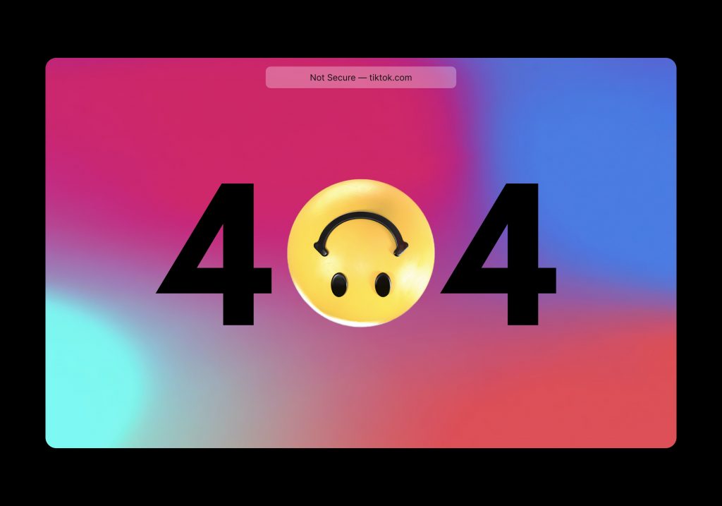
The 404 page used to be relegated to a website’s fringes, ignored and feared by both developers and website visitors. These three little numbers refer to the error message displayed when a server can’t find a particular resource.
For most sites, this ‘dead space’ is an inevitable reality that needs to be designed in a way that is just as engaging with their visitors as other pages. And when it comes to eCommerce, 404 pages should not be dead-end for online shoppers as it’s a leading cause for bounce and we all know how changeable online shoppers can be.
Instead, why not use the page to solicit conversions, keeping visitors on your site and linking them to more useful pages or a face full of striking brand identity.
Error 404 – The page you are looking for cannot be found.
Technically, any visit to a 404 page should send an alert to your analytics, enabling you or your website administrator to track and fix any errors when they occur. A 404 error is often the result of a mistyped URL or an old link that is not used anymore, but if you find it becomes a regular occurrence in your analytics, something more problematic is afoot.
Permanent redirects (also known as 301 redirects) are your best bet to weed out the broken URLs both on-site and off. This system automatically redirects old URLs to new ones, preferably ones that are still relevant to the end-user. However, this process can be long and time-heavy so it can be beneficial to employ an expert website development agency like Myk Baxter Marketing to do the hard work for you.
With 301 redirects implemented, 404 errors should reduce significantly. But there’s always a chance a 404 will still rear its head. In this case, use it to your advantage with some striking copy that gets your brand recognised or useful links to help keep visitors on-site.
With so many creative ways to adapt your 404 error page, it can be helpful to consult with a website developer or marketing specialist to ensure your message is on-brand and on-point.
At Myk Baxter Marketing, a small obsession with 404 error pages has our teams always ready to explore the useful (and the wacky) alternatives that help eCommerce sites keep hold of their visitors and solicit conversions. Here are just some examples:
Navigation – Fill you 404 error screen with links to product departments or your latest promotions to keep users clicking.
Search Function – Keep the visitor in control by including a search bar in the centre of your 404 error page, allowing them the freedom to find what they’re looking for one more time.
Recommendations – Instead of using links, why not showcase some of your most popular products? This not only helps redirect visitors back into the site, but also can lead to impulse buys.
Strong Brand Imagery – Either visual- or copy-focused content that helps define your brand can engage visitors and improve their brand recognition. A meme or something funny can also go viral on social media if you’re creative enough, and the social zeitgeist stars align.
Report a Problem – Depending on your type of business, you may want to include an online form allowing users to tell you exactly what went wrong. This is advisable for businesses with the resources to reply, as not responding to visitors is a significant reason for lost custom.
Include a Game – People online love to procrastinate. Google Chrome has a dinosaur jumping game when there is no internet, so why not do the same and include some fun game or interactive element to the 404 page, letting your visitors take a quick breather.
These are just a few of the more exciting 404 page elements that Myk Baxter Marketing likes to implement, but the options and opportunities are almost endless. Get in touch today to see how they can redesign your website or eCommerce store to relate better with your clients, streamlining their visit and engaging them on a level that keeps them coming back again and again.
The post Turning The 404 Page into Conversion Supercentres appeared first on eCommerce Expert.


